Mapping Great Dreams

Infrastructure Projects Mapped by Reconnecting Asia
“A map is the greatest of all epic poems,” National Geographic magazine’s founding editor once wrote. “Its lines and colors show the realization of great dreams.” At Reconnecting Asia, our maps show not only dreams realized but also ambitions that are still unfolding. Our Competing Visions series, for example, is forward-looking and illustrates regional powers’ bold infrastructure plans. Providing a closer look at today’s ground reality, our interactive map tracks the full lifecycle of projects, from announcement to completion or cancellation.

We’re also leveraging GIS tools to analyze and visualize our growing data. To share some of that work, we’re launching the (X, Why) series, which dives into our growing database and uses GIS to investigate the drivers and implications of Asia’s massive infrastructure push. Of course, any analysis is only as good as the underlying data. That’s why, especially early on, we’ll be cautious about making causal claims. Instead, we’ll focus on describing the data. In that spirit, this series will aim to explain not only verbally, but also visually.
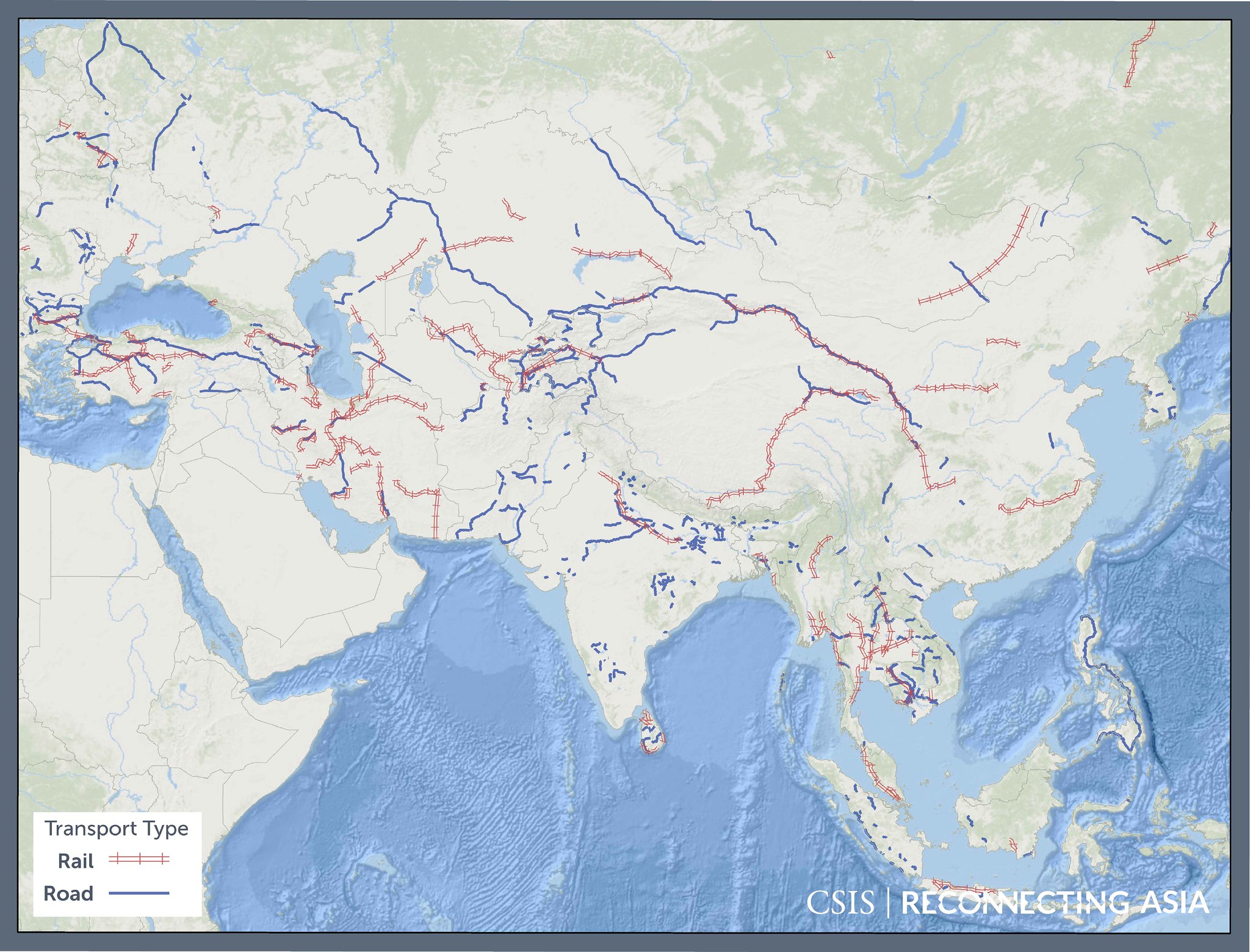
This opens up some exciting avenues for analysis. Above, in what looks like the beginnings of a Jackson Pollock painting, we’ve illustrated all the road and railway projects with geodata (precise location information) in our database. For now, as our database continues to grow, this map likely says more about the challenges of data collection than developments on the ground. But there is a potential takeaway with practical implications. Our approach relies on open sources, so the absence of activity in certain areas on our map could also stem from a lack of transparency around project documentation.
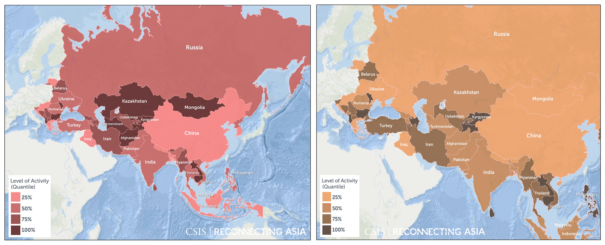
We can also identify “hot spots,” or areas of high activity. In the maps below, we’ve examined activity from two angles. In the red map, we evaluated activity as it relates to land mass. In the yellow-brown map, we’ve done so with respect to gross domestic product (GDP). What the results have in common is an emphasis on Southeast Asia and Central Asia – two areas that we suspect will be important to watch going forward. These results also suggest that Asia is not only reaching westward via new land routes but also connecting internally. We’ll see if these patterns hold as our database expands.
Project Points Divided by Area (left) & Project Points Divided by GDP (right)

Zooming in to the national and local level, there are many possibilities for more granular analysis. Using existing GIS datasets, we can see how infrastructure projects interact with their environments. For example, drawing from the Global Terrorism Database, one of our former researchers examined the China-Pakistan Economic Corridor’s security environment. Using demographic data, we can evaluate the proximity of proposed routes to population centers. Usage data, whether from traditional sources like toll data or through crowd-sourcing platforms like Waze, present opportunities to evaluate project performance. Climate data can help identify at-risk projects that must adapt to changing environmental conditions.
In the weeks and months ahead, we’ll be experimenting with these and other sources and sharing our results. If you’d like to see something investigated, drop us a line at recon@csis.org. And if you’re a data curator or GIS specialist that wants to contribute, please take sixty seconds to fill out partnership form here, and we’ll be in touch. At Reconnecting Asia, the epic poems we’re writing are collective endeavors and pushing the realization of dreams.
Jonathan Hillman is the Director of the Reconnecting Asia Project at the Center for Strategic and International Studies.